welcome to the worst page on the website. this is going to be completely unfiltered nonsense with no coherency at all, and probably Very illegible and unhinged.
first order of business: Northwestern Indiana Transit Agency (NWITA) is the state's organization, Duneland Eastern (DLE) is the passenger service, Duneland Freight (DLF) is the freight railroad, Chicago Duneland & St. Joseph (CD&St.J) is the full historic name, and post-subsidiary-ization of DLF Duneland is now Dunelands.
Yes, we have valid reason to not refer to the names of these things directly. This is done so we don't accidentally have our website show up in search results for the real thing. We are treading on VERY THIN ICE even just PSEUDONYM-ING IT.
anyways, entries below:
April 17th, 2025 @ 19:40 EST
HOLY FUCKING SHIT NEW STATION TOMORROW
WOOOOOOOOOOOOOOOOOOOOOOOOOOOOOOOOOOOOOOOO
ok not actually tomorrow but. the station next to that lake town
(yea we haven't come up with replacement names for all of the places yet oops) is getting another, bigger station just east of it Maybe and Holy Fuck am i excited for that. God DAMN.
April 16th, 2025 @ 20:58 EST
nothing of note atm, though i would like to rant about something rq.
WHY THE FUCK DID NWITA MAKE SUCH A FUCKING COOL ROUND PIN-ESQUE LOGO IN 2002 AND NEVER FUCKING USE IT FOR ANYTHING OTHER THAN THE HEADER??? AND AT SUCH A SMALL SCALE TOO?????????
AS A WHOLE THIS RAILROAD FUCKING SUCKS AT ARCHIVING ITS LOGOGRAPHY??? LIKE. IF YOU LOOK UP ANY LOGOS OF IT ONLINE, ESPECIALLY THE CANDY WRAPPER LOGO, IT'LL JUST BE COMPLETELY WRONG???
like. okay. hold on.
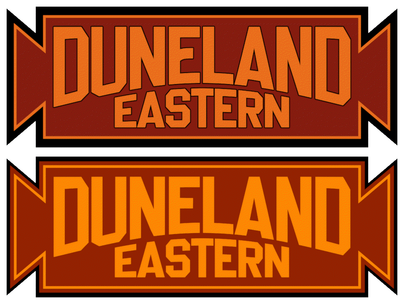
okay, so the top one here is the actual logo, right. the bottom being the one they use on the internet everywhere, yeah?
What the Fuck is this.
Why Is It Like That.
Like, okay. I can excuse the maroon border to the orange stripe, but like. Why did they remove the outline to the lettering. Why does the E in DUNELAND no longer curve. What.
How did they manage this. How. Please tell me.
On a similar note too: WHY ARE ALL OF THE NWITA LOGOS ON THE INTERNET COMPLETELY THE WRONG FONT???????? and the only one that ISN'T is FUCKING CROPPED IN A WAY THAT CUTS IT OFF SLIGHTLY AND LIKE 2 PIXELS TALL.
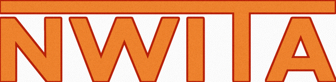
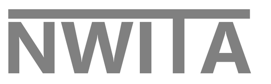
LIKE. WHAT ARE THESE. HOW DOES A STATE OWNED COMPANY NOT HAVE HIGH RESOLUTION LOGOS READY FOR AT LEAST MEDIAKIT PURPOSES?????????????????
THIS IS LIKE IF THE NATIONAL PARK FOUNDATION ONLY HAD A LOGO AVAILABLE THAT LOOKED LIKE FUCKIN' THIS